
Color palette generator
Create consistent color palettes
With Colllor it is much easier to generate a consistent web color palette with just a few clicks. You should use colors consistently, so you have a common look and feel throughout your design. All the alternative proposals produced by Colllor derive from the same color and they all have a common denominator sharing hue, lightness or saturation values. This tool will let you find the exact value of darker shades of any color, not just something that 'looks darker'. That will be a huge step towards professionally looking design.
Numerous variations to choose from
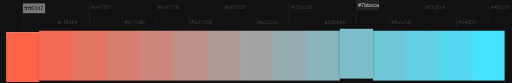
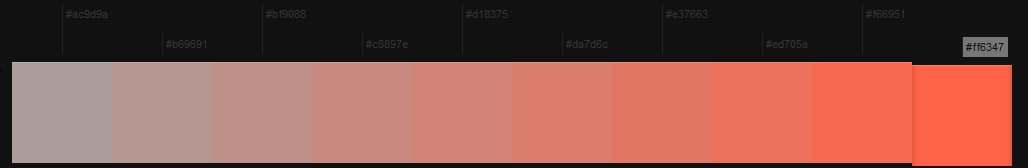
Every color can have many variations. With this tool you can explore the following options:
- tints and color shades - produced by adding adding white or black (respectively) to a pure hue
- tones - created by adding gray to a pure hue and showing less or more saturated options
- color mixing - add some other color to your original one (to make it more bluish for example)
- similar colors - the ones that are next to the original one on the color wheel - they can become part of the palette or become an alternative.
Use plain English or Hex color names
You can put in color names in Hex code or simply in plain English. You can also provide the initial color directly via the URL. For example:
- colllor.com/ff0000 -the results for #ff0000
- colllor.com/red - an easy way to analyze red (#ff0000)
- colllor.com/skyblue-brown - if you want to mix the original color with a specific one you can include it in the URL as well - in this case the results for skyblue will show a mix with brown.
You can use any name from a list of X11 color names.
Color palette ideas
Let's see what is the intrinsic meaning of the colors and the best color combinations for our potential color schemes.
Red
Red is the most vibrant color and it expresses many positive feelings in life. It is the color that is able to attract our attention almost immediately. Red is the color of the audacity, determination, it stimulates a sense of urgency and immediacy. Some studies have shown that in the presence of red an average consumer tends to spend more and buy more quickly. Red is also the color of danger, and is often associated with unpleasant situations (as red as blood, red as an emergency signal, red as debt). Red can be combined with the orange or green to produce a successful color scheme. Use a darker shade of this color in designed that need to express sensuality and femininity (such as cosmetics and perfumes). Avoid the red websites in the medical / health related projects and those in the financial sector (red is the color of the decline and the economic problems).
Yellow
Yellow is the most beautiful color of the color wheel: it is the color of sunshine, joy and optimism. Yellow has the potential of the red, but without its side effects: it attracts attention, creates energy and expresses positive feelings but it is also reassuring. Yellow is the color most loved by young people, and the used extensively in children's drawings. If you want a bright color that will intrigue and engage positively both young and old, yellow - as well as orange - is the color to choose. This color, such as red and orange, stimulates the appetite and is therefore particularly suitable for design projects that have to do with food. Yellow is very bold and can be used as a special touch to your designs. If you have to design a website for youth activities experiment with yellow and orange. This color must not be used in sites that need to express elegance and professionalism, because it too bold for that. Black writing on a yellow background is easy to read and therefore often used for warning signs. In general, the contrast between the black and the yellow is really very effective, both from a purely aesthetic point of view and from that of communication.
Orange
Orange is a very vibrant, dynamic and welcoming color. It combines strength and momentum of red with joy and vitality of yellow. Being a warm color, it is excellent for attracting the attention and giving your designs a strong emotional value. Combining orange with a cool color (blue or purple for example) always works. Orange, as well as the yellow, is particularly suitable for designs that express imagination and creativity. Remember, the best color combinations with orange is when it is combined with a very intense blue, because in this way its natural brightness will be emphasized.
Blue
Blue is a very relaxing and positive color, expressing a feeling of comfort, tranquility and peace. In some ways we might call this color the perfect antagonist to red: if red increases the heart rate and blood pressure, with blue you can get the opposite effect. If the red leads to immediate action, blue is the color of the reflection, rational thoughts and calmness. Blue is a color that instinctively inspires confidence and the sense of comfort. Blue is particulary useful for designes related to health and finances. More generally, anywhere you want to win consumers' trust and convince them to buy, invest or to rely on your experience.